City of Morgantown
![]()
In Morgantown’s case, we were looking at a city in crisis. The city government had new leadership, and they were embracing new ideas and directions for the city. Still, Morgantown had been stagnant for so long that the local consensus was skeptical, “Morgantown could never recover, and everyone is wasting their time.”
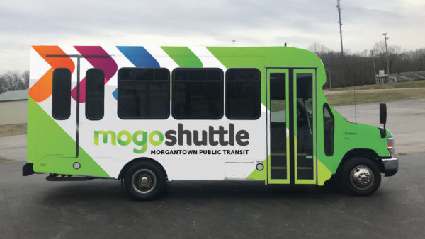
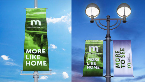
When we were called in, the City had tossed around some ideas and had settled on “More Like Home,” but that’s as far as they could get, and they desperately needed a brand overhaul to restore confidence and breathe new life into the local populace. Morgantown needed to feel new and exciting.
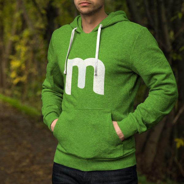
So we started by giving them a versatile identity rework that was colorful, youthful, clean, and easy to understand. We also expanded on the “More Like Home” concept and used that angle in our advertising to reinforce the idea that the Mayor and Co. weren’t resting on their laurels and they were going to bring MORE. (See, Marketing. How you see yourself!)
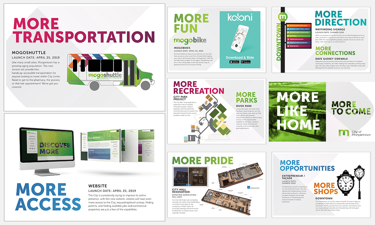
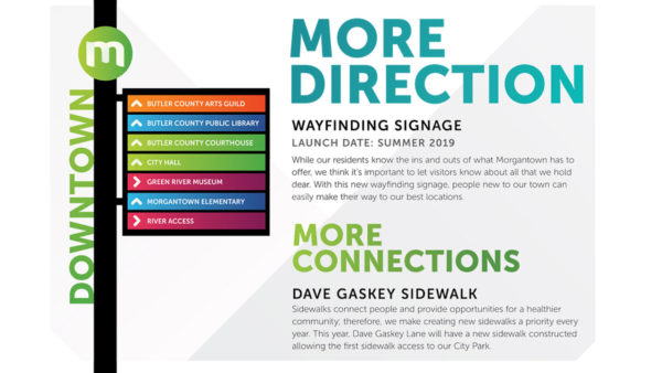
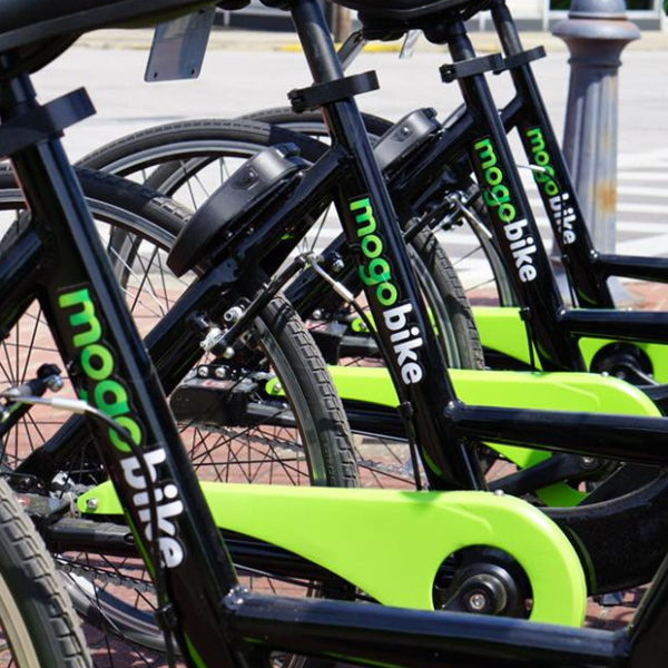
Then we helped develop a plan to deliver all of these fresh ideas to the public. We built a new website, promotional designs, designed a wayfinding signage system, street banners to promote the rebrand, a system of templates to use on social media, a bike-share program, and a BUS, Morgantown’s first public transit system. (That’s how you act in public.)
Feedback has been overwhelmingly positive. Morgantown has plans to renovate its City Park and make better use of its river access. This rebrand has given them the confidence and helped gain the support to do those things. The city recently passed a restaurant tax to help fund this new growth, a topic that was a major point of contention in the months before the rebrand because a brand is an identifier AND A PROMISE. (The local Mayor promised the citizens MORE, that’s what he gave them, and public perception went from Achilles Heel to Superpower thanks, in part, to Yellowberri’s help.)